-
In this class project, I was tasked with rebranding an organization from a curated list provided by my instructor. I decided to focus on tone and messaging, which would then inform a visual refresh.
-
Planned Parenthood is first and foremost a health care provider. How can we better inform the public of this organization’s services while also navigating antagonistic political climates?
-
There’s no way to control how the general public feels about Planned Parenthood, but the organization can choose how to respond through careful selection of language and imagery without compromising their core values and beliefs. Taking steps toward educating the public about their wide breadth of services and focusing on building community is a worthwhile endeavor.
Although their social media presence is sassy and educational, this approachability doesn’t extend into the real world. Planned Parenthood often feels synonymous with “last resort,” when that shouldn’t be the case.
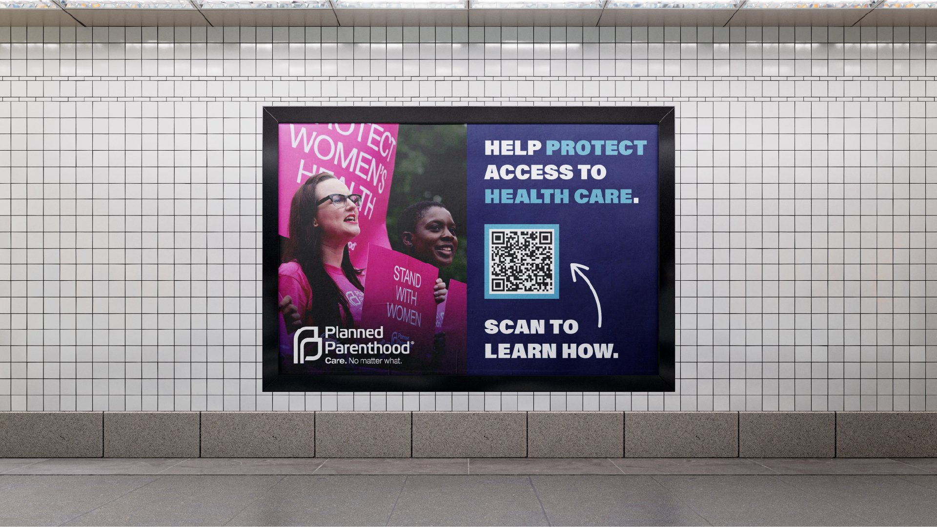
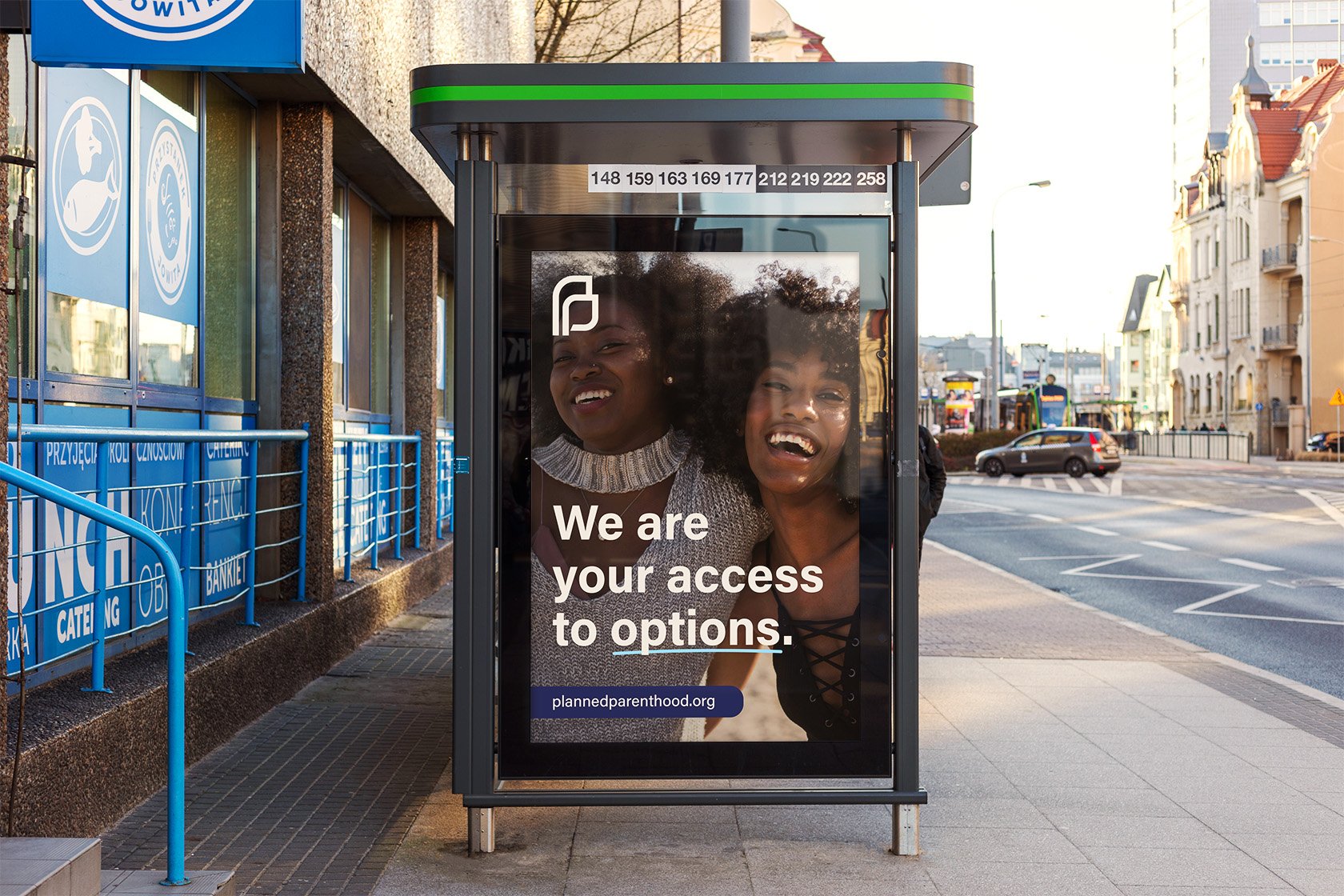
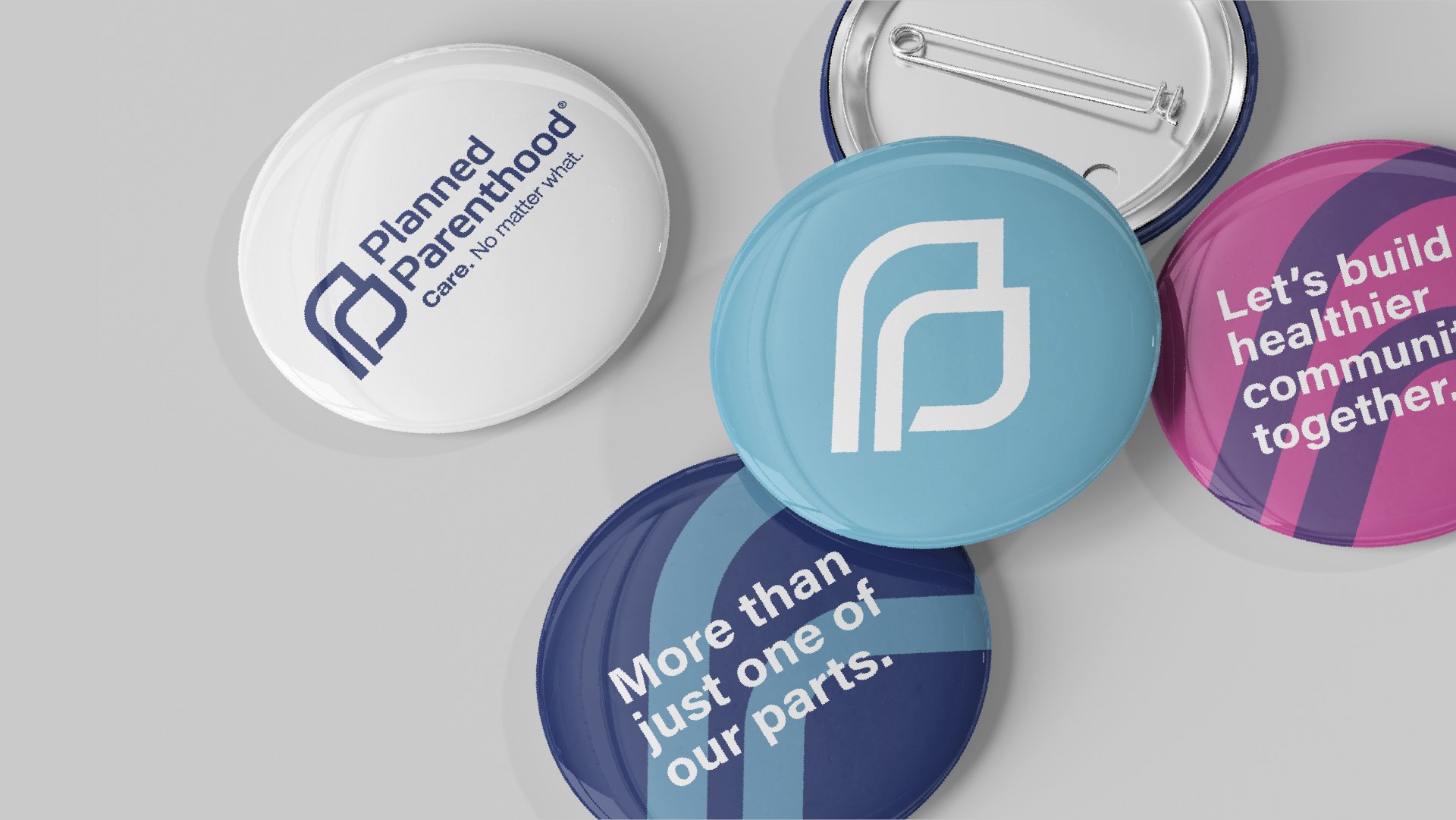
How can Planned Parenthood establish themselves as a pillar of accessible healthcare? To address this issue, I crafted visuals for an imaginary campaign focused on nurturing community relations and encouraging people to get involved by volunteering or donating.

I selected photographs that are colorful and vibrant. The goal is to elicit feelings of comfort and warmth, serving as a contrast to how sterile and unwelcoming many of their clinics feel.


